ECOTRACK
A SAAS product for companies to measure and reduce their carbon footprint and reach net zero
Client
Ecotrack solutions
Role
Product Designer
Timeline
1 week
Services
Web design
Ecotrack
Your journey to net zero.
A software that will help you manage, track and reduce your company's carbon footprint

Ecotrack
Your journey to net zero.
A software that will help you manage, track and reduce your company's carbon footprint
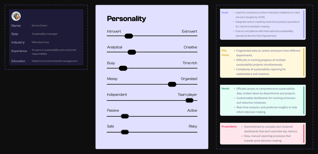
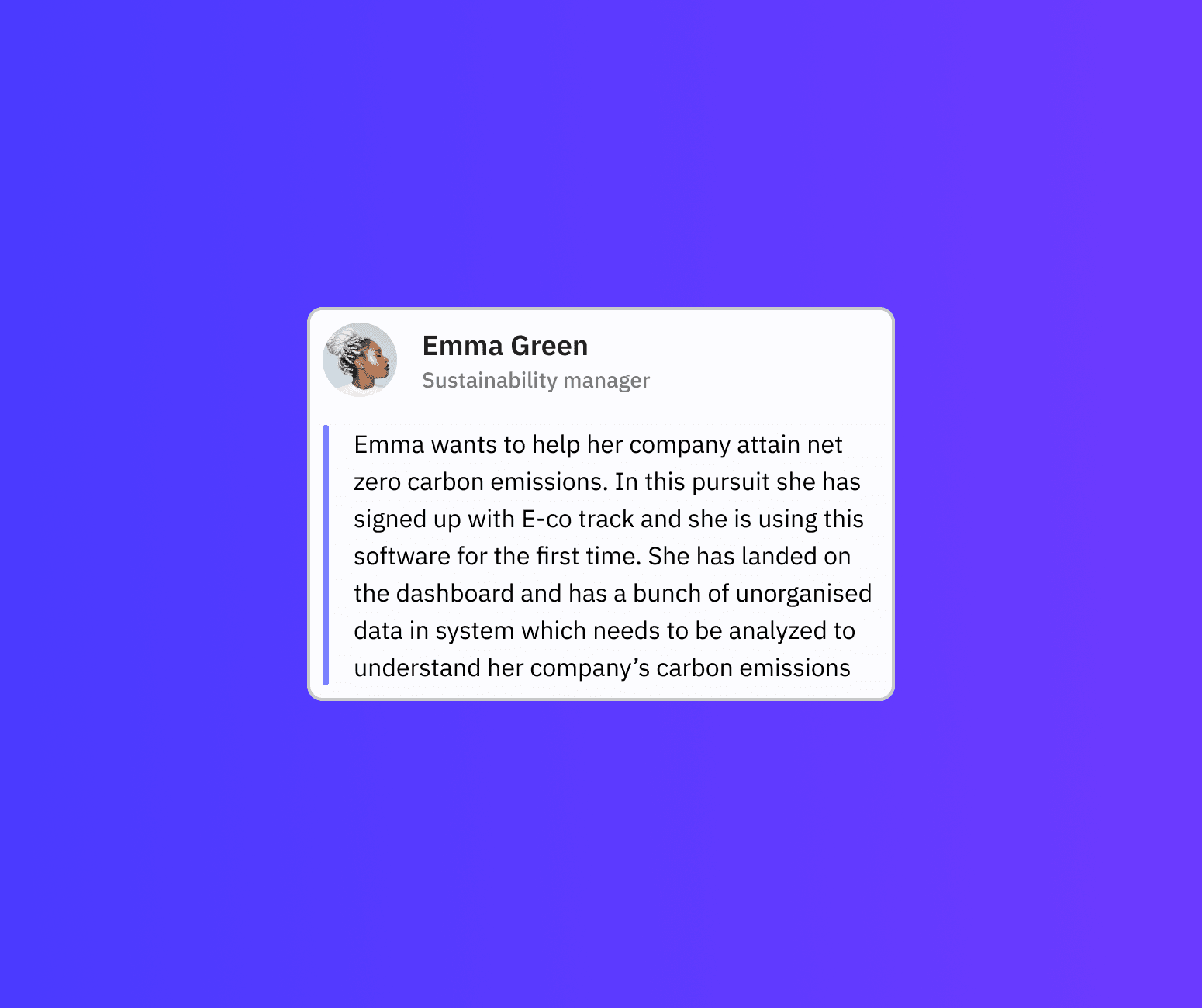
Emma is our user personified. She is vocal about sustainability and has been hired by Company X to reduce their carbon footprint to zero by year 2030.
Read a bit about her below -
Emma is our user personified. She is vocal about sustainability and has been hired by Company X to reduce their carbon footprint to zero by year 2030.
Read a bit about her below -

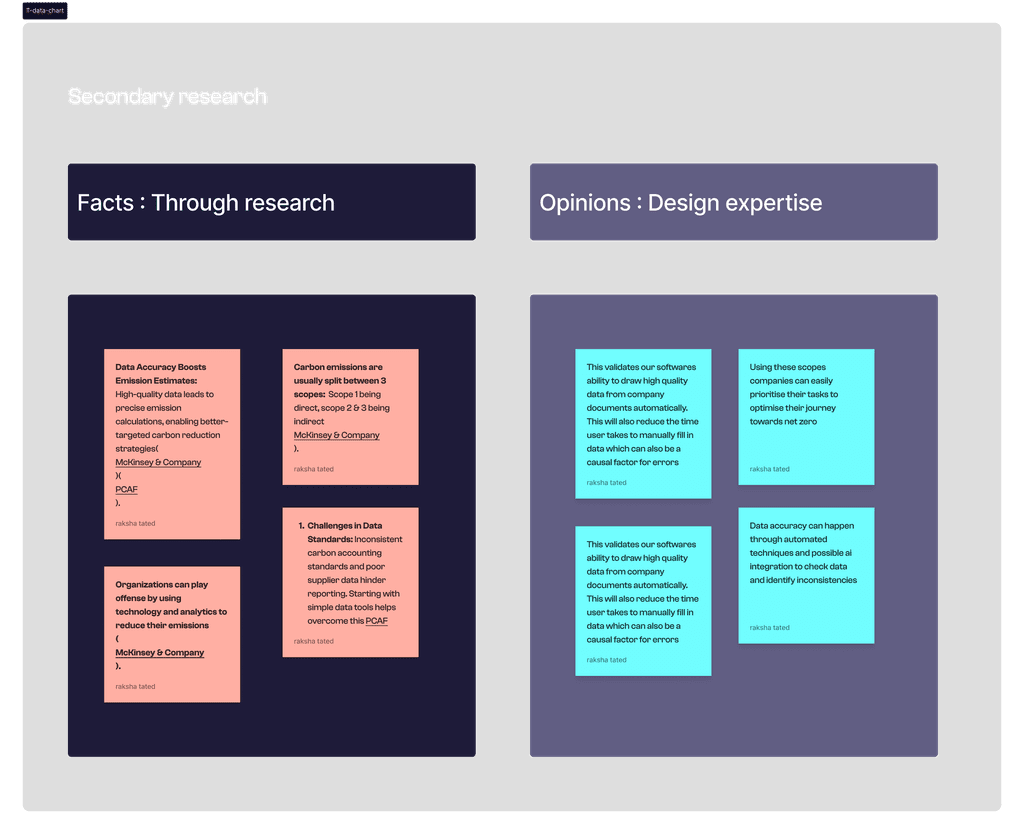
To build a product for users like Emma we would first need to deep dive into what are the current gaps in the carbon emission control protocols and where do companies stand today
To build a product for users like Emma we would first need to deep dive into what are the current gaps in the carbon emission control protocols and where do companies stand today

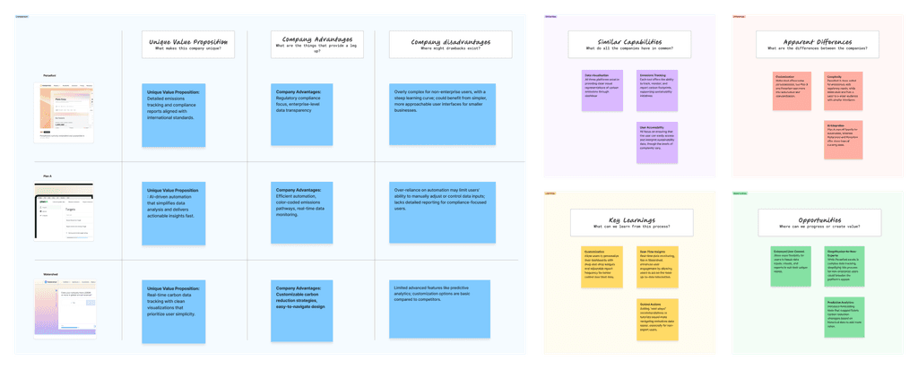
Let's look at a few competitors in the space : Persefoni, Watershed and Plan A to understand the following
Unique Value proposition
Company advantages
Company disadvantages
Similar capabilities
Differences
Learnings
Opportunities
Let's look at a few competitors in the space : Persefoni, Watershed and Plan A to understand the following
Unique Value proposition
Company advantages
Company disadvantages
Similar capabilities
Differences
Learnings
Opportunities


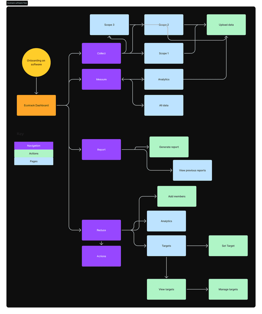
Forcing a double diamond, EDIPT or another design process where not necessary with every client does not necessarily make a good design, sometimes it's of the essence to jump into direct actionables, so here we start with sitemapping since we already know the product features we want this software to entail
Forcing a double diamond, EDIPT or another design process where not necessary with every client does not necessarily make a good design, sometimes it's of the essence to jump into direct actionables, so here we start with sitemapping since we already know the product features we want this software to entail



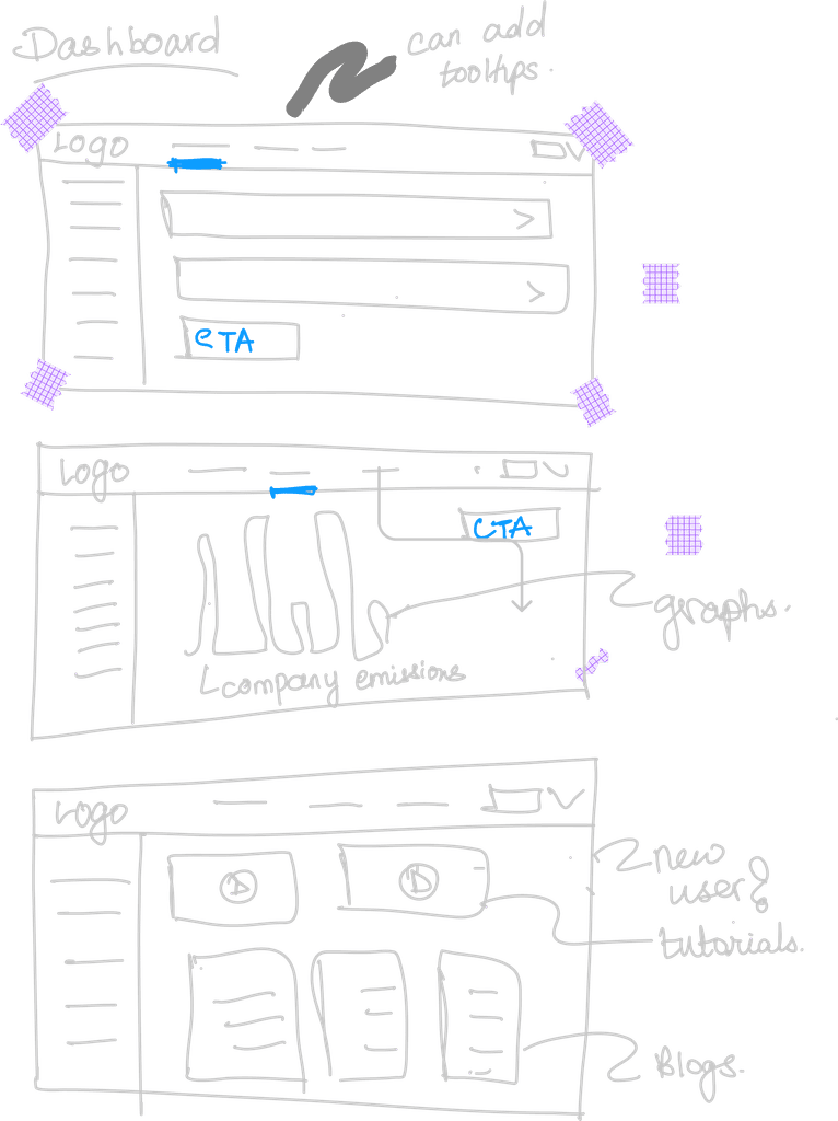
Low fidelity wires to have a layout to start designing from
Low fidelity wires to have a layout to start designing from

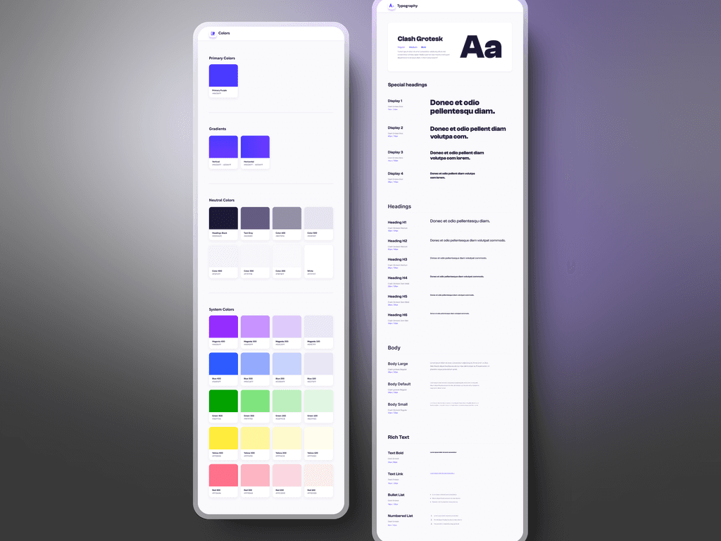
Establishing a style guide
Establishing a style guide

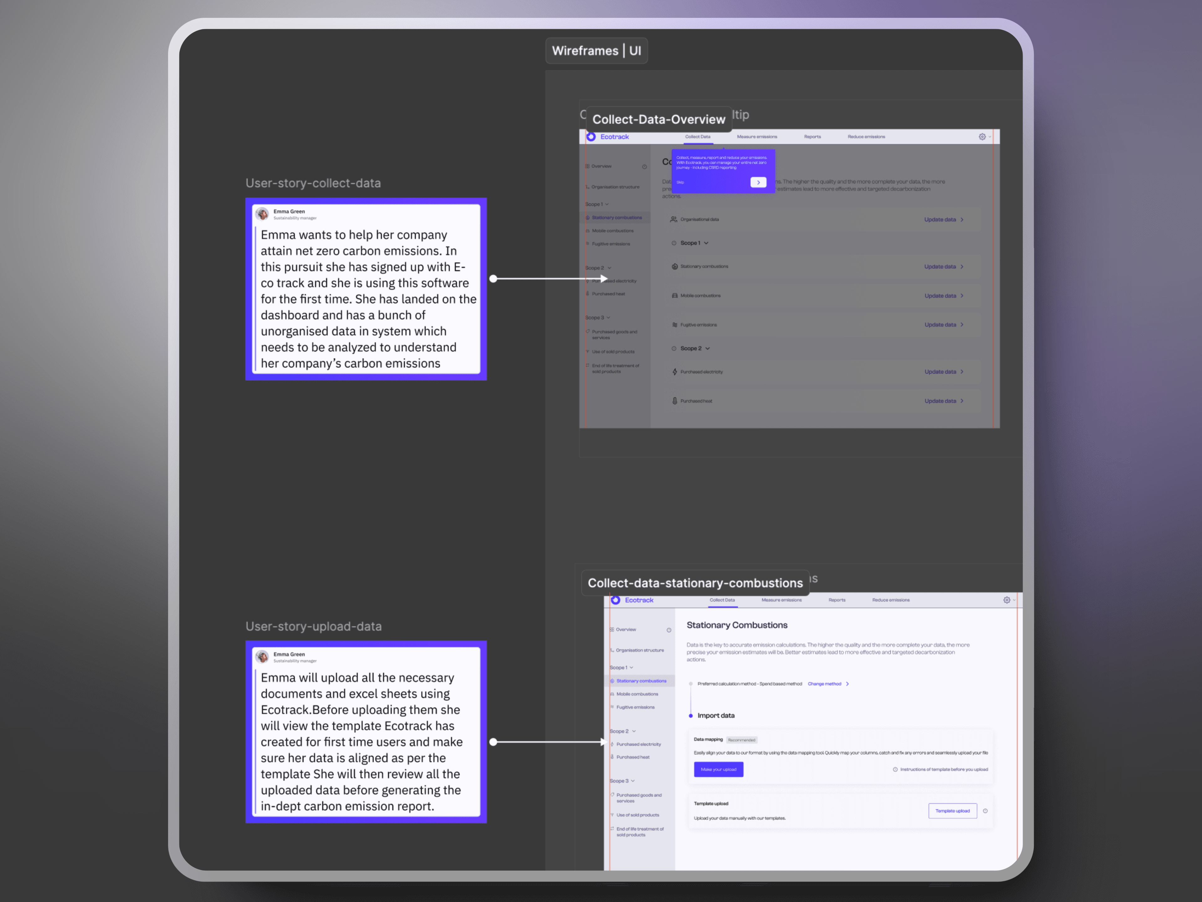
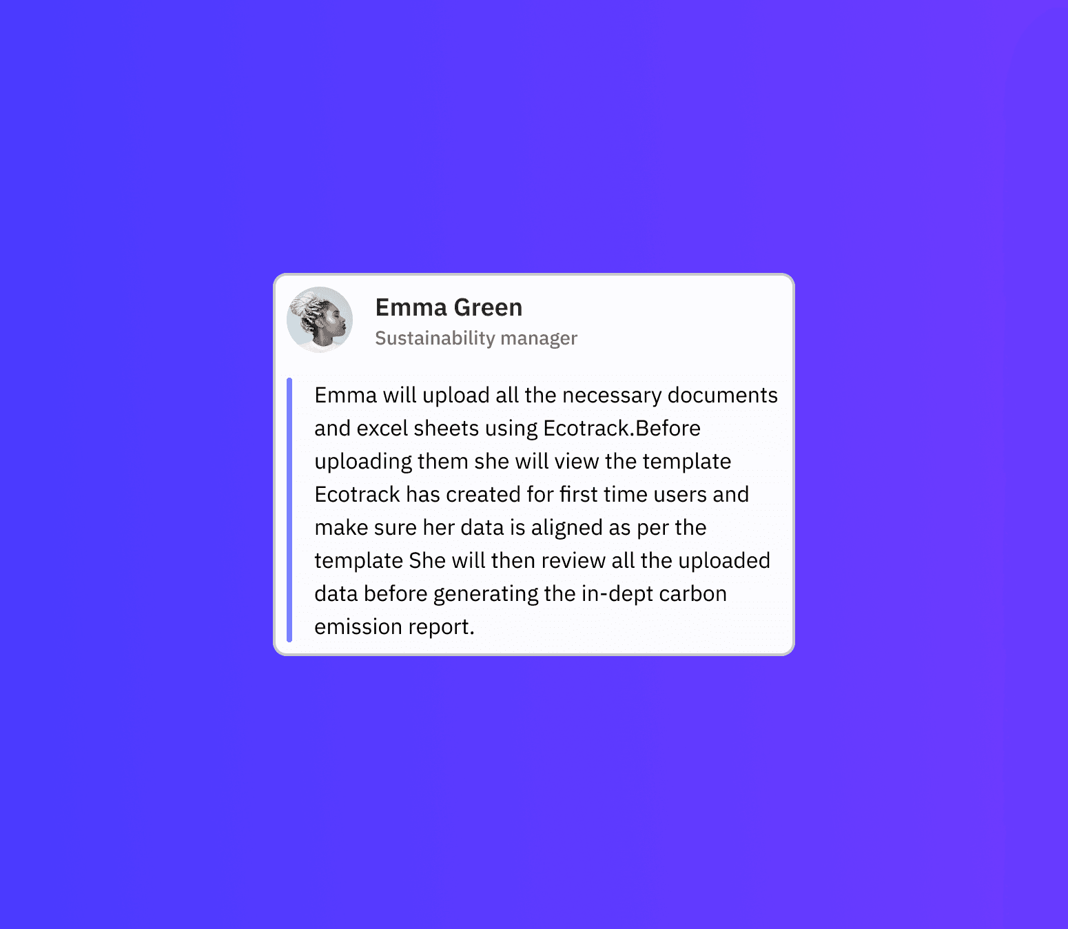
User story 1

On this interface, the navigation menu features four tabs- Collect, Measure, Reports, and Reduce, arranged hierarchically. Gather data from the company's users, quantify their emissions, generate a data report, and devise strategies to reduce emissions.
On this interface, the navigation menu features four tabs- Collect, Measure, Reports, and Reduce, arranged hierarchically. Gather data from the company's users, quantify their emissions, generate a data report, and devise strategies to reduce emissions.

Dashboard: The scopes are segregated into three categories here, and users can distribute data into these categories based on the organizational structure agreed upon during onboarding.
Dashboard: The scopes are segregated into three categories here, and users can distribute data into these categories based on the organizational structure agreed upon during onboarding.

User story 2

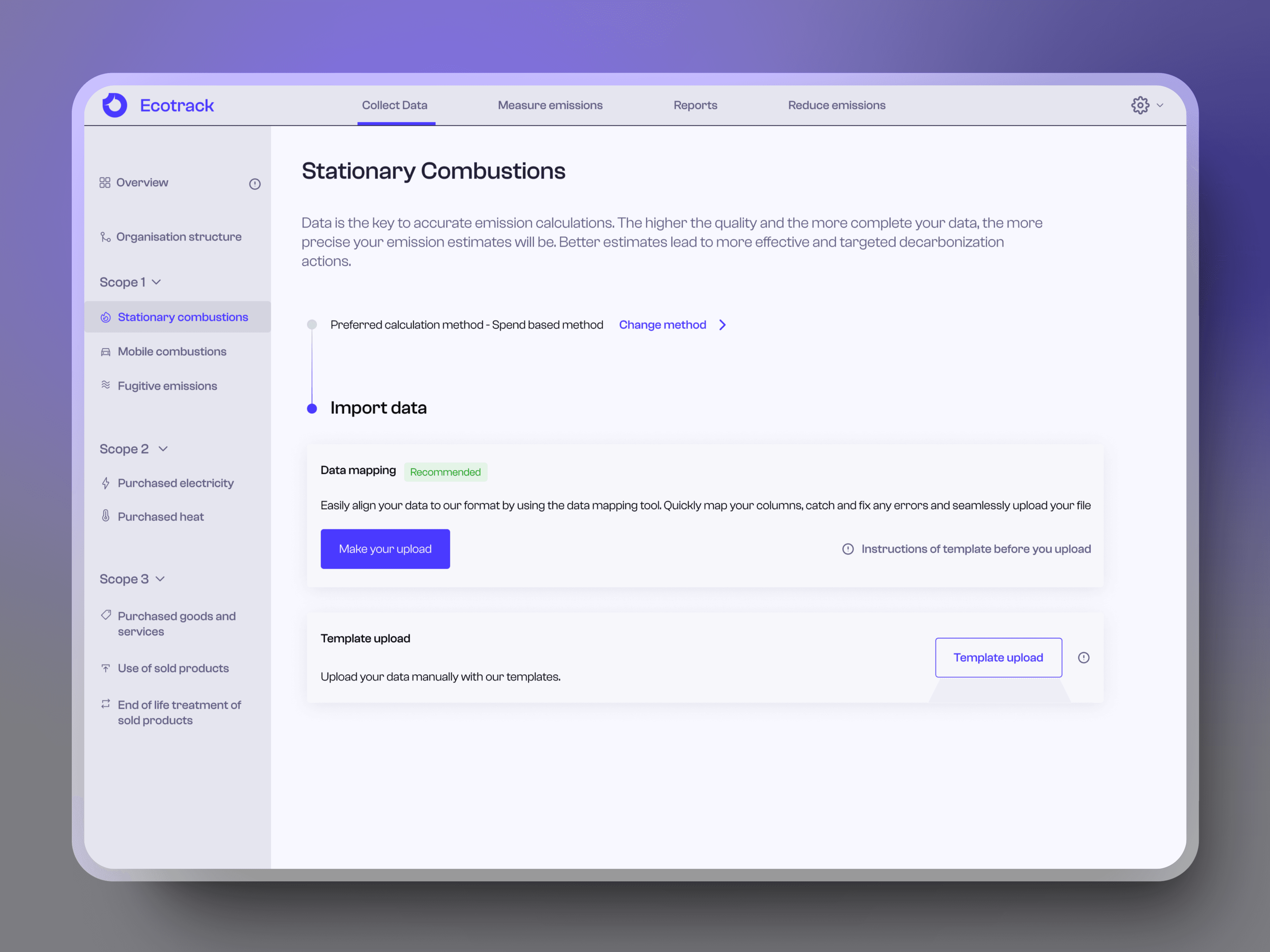
The user is directed via a tooltip to proceed to the subsequent step: a prompt to upload organization documents relating to their specific category. Should they decide to upload, our platform will autonomously interpret and populate the information. They will be granted the option to view a sample template or instruction manual prior to committing to the uploads.
The user is directed via a tooltip to proceed to the subsequent step: a prompt to upload organization documents relating to their specific category. Should they decide to upload, our platform will autonomously interpret and populate the information. They will be granted the option to view a sample template or instruction manual prior to committing to the uploads.

Users have the choice to manually enter data following the Ecotracks format as well, though this might be slightly more time consuming, which is why a secondary CTA has been used for this action
Users have the choice to manually enter data following the Ecotracks format as well, though this might be slightly more time consuming, which is why a secondary CTA has been used for this action
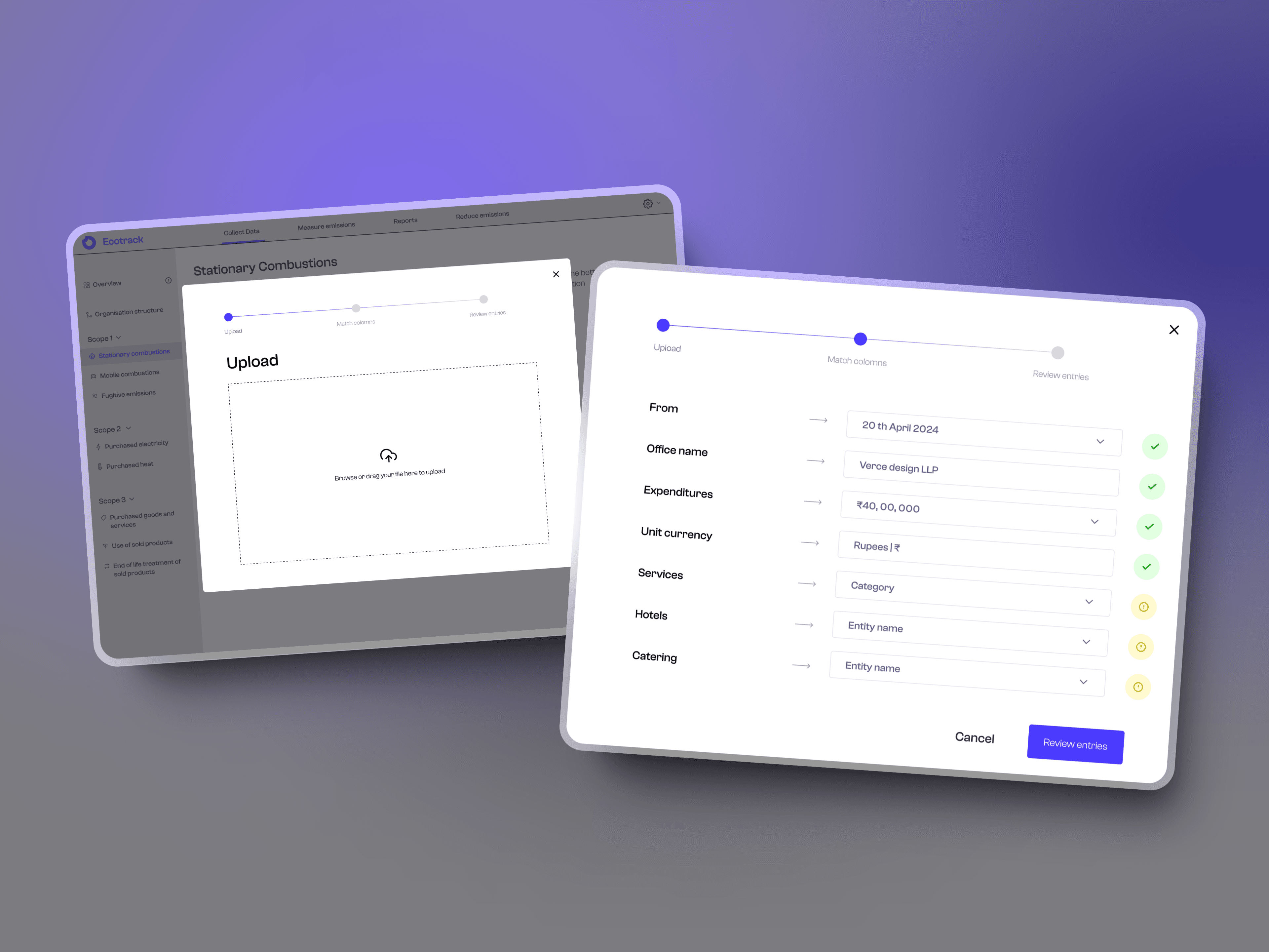
Once the document is uploaded, as previously stated, the user's file is scanned by our AI/automated reading system and data is populated automatically. Omitted data is highlighted with a subtle yellow indicator as a gentle reminder for the user to provide the missing data and scrutinize the entries in the conclusion.
Once the document is uploaded, as previously stated, the user's file is scanned by our AI/automated reading system and data is populated automatically. Omitted data is highlighted with a subtle yellow indicator as a gentle reminder for the user to provide the missing data and scrutinize the entries in the conclusion.
User story 3

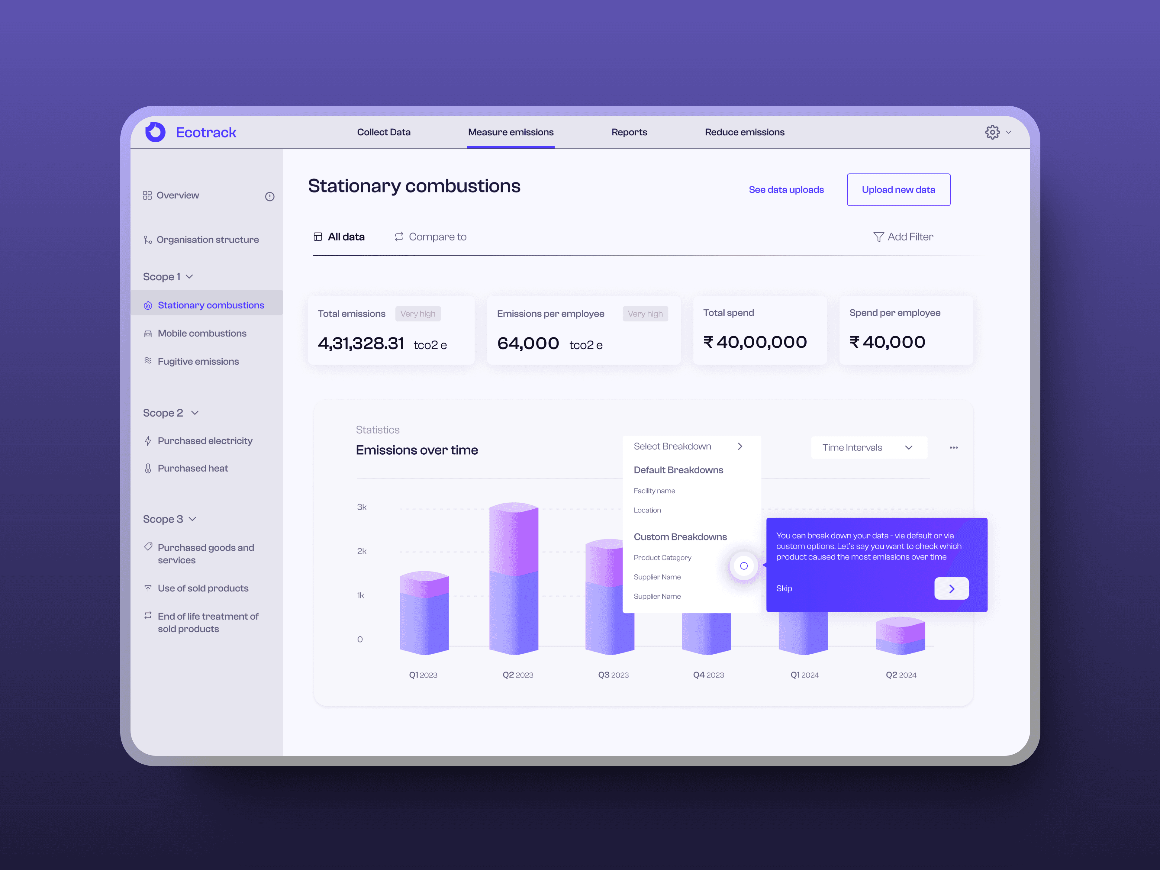
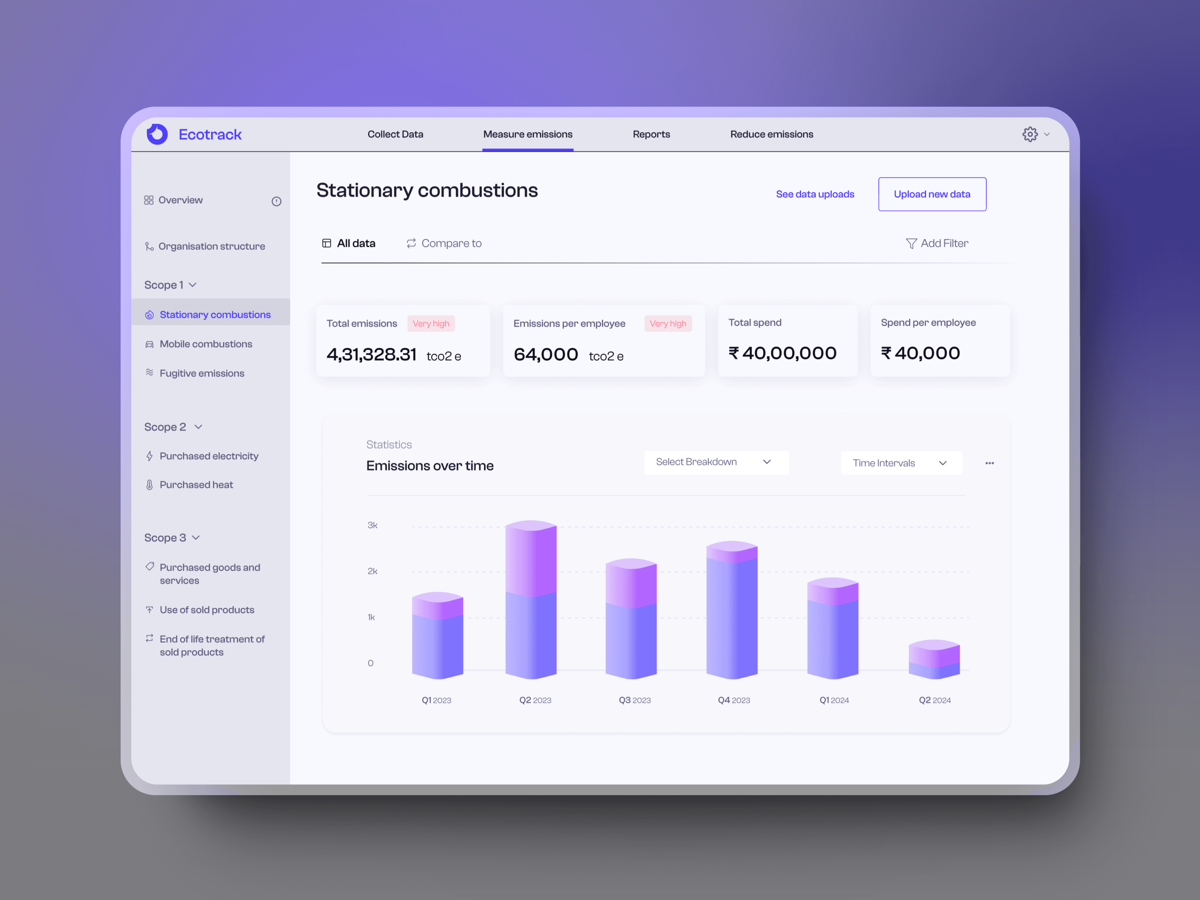
In this section, the user is navigated via a tooltip to proceed to the next phase, where they are encouraged to employ the filters and dropdown menus in the analytical graph constructed from the user's uploaded data. Labels such as (very high) on the upper tabs indicate the present carbon emission status of their organization. The user is presented with key metrics, and they have the option to modify the chart using both preset and customized breakdown categories.
In this section, the user is navigated via a tooltip to proceed to the next phase, where they are encouraged to employ the filters and dropdown menus in the analytical graph constructed from the user's uploaded data. Labels such as (very high) on the upper tabs indicate the present carbon emission status of their organization. The user is presented with key metrics, and they have the option to modify the chart using both preset and customized breakdown categories.

The data can also be compared to particular year under compare to segment to further detail the data and they can see all the data uploads previously done and also upload new data to see quick analytics of it.
The data can also be compared to particular year under compare to segment to further detail the data and they can see all the data uploads previously done and also upload new data to see quick analytics of it.
User story 4

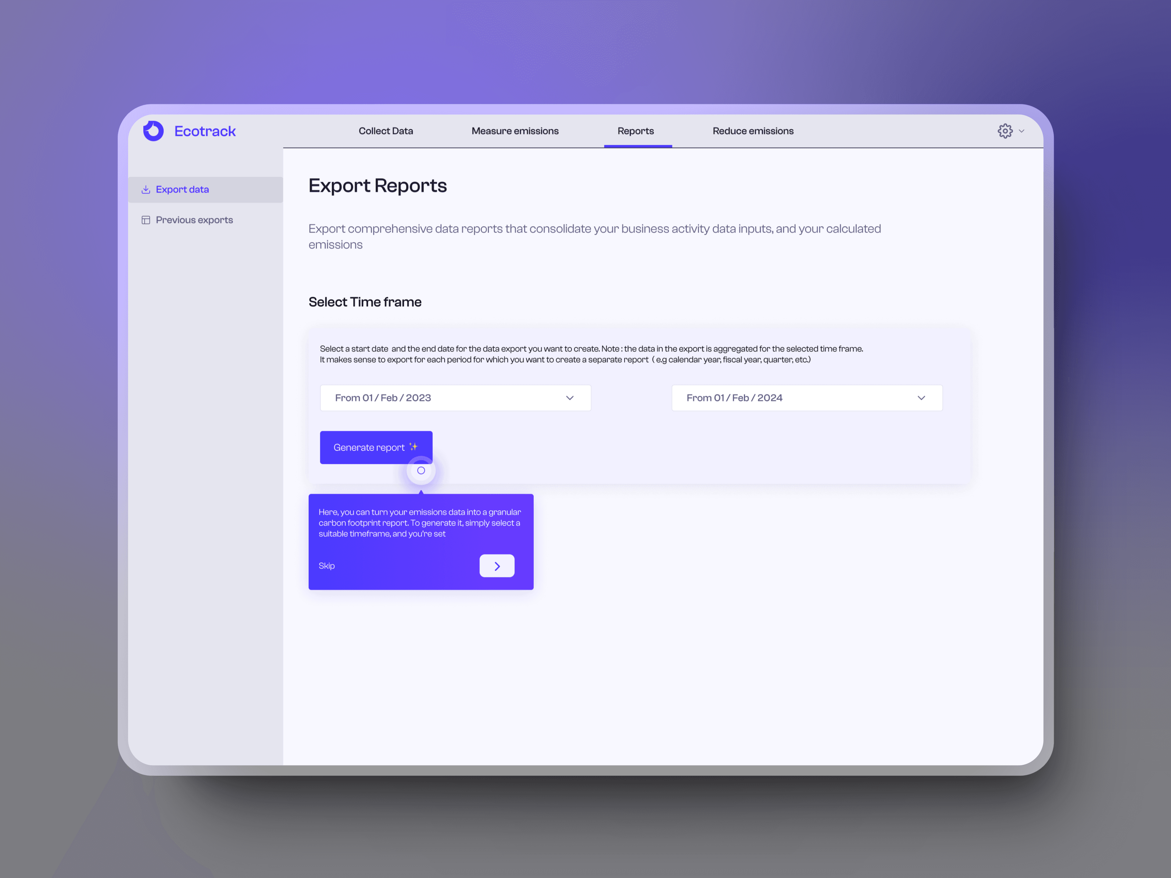
The user is directed via a tooltip to proceed to the subsequent stage, where can create their company's official carbon emission reports using the data they have uploaded over a specific duration. This process is automatic. The user can also access previous reports
The user is directed via a tooltip to proceed to the subsequent stage, where can create their company's official carbon emission reports using the data they have uploaded over a specific duration. This process is automatic. The user can also access previous reports
User story 5


If the user is new, or coming here for they first time they will be shown introductory videos, helpful blogs to use this software and how to set goals and targets. Each blog has labels to help user scan through the topics.
If the user is new, or coming here for they first time they will be shown introductory videos, helpful blogs to use this software and how to set goals and targets. Each blog has labels to help user scan through the topics.

If the user is a repeat user, they will see their list of targets and will be able to manage them here, they can also set new targets and add their team members to align everyone on the targets and actions.
If the user is a repeat user, they will see their list of targets and will be able to manage them here, they can also set new targets and add their team members to align everyone on the targets and actions.
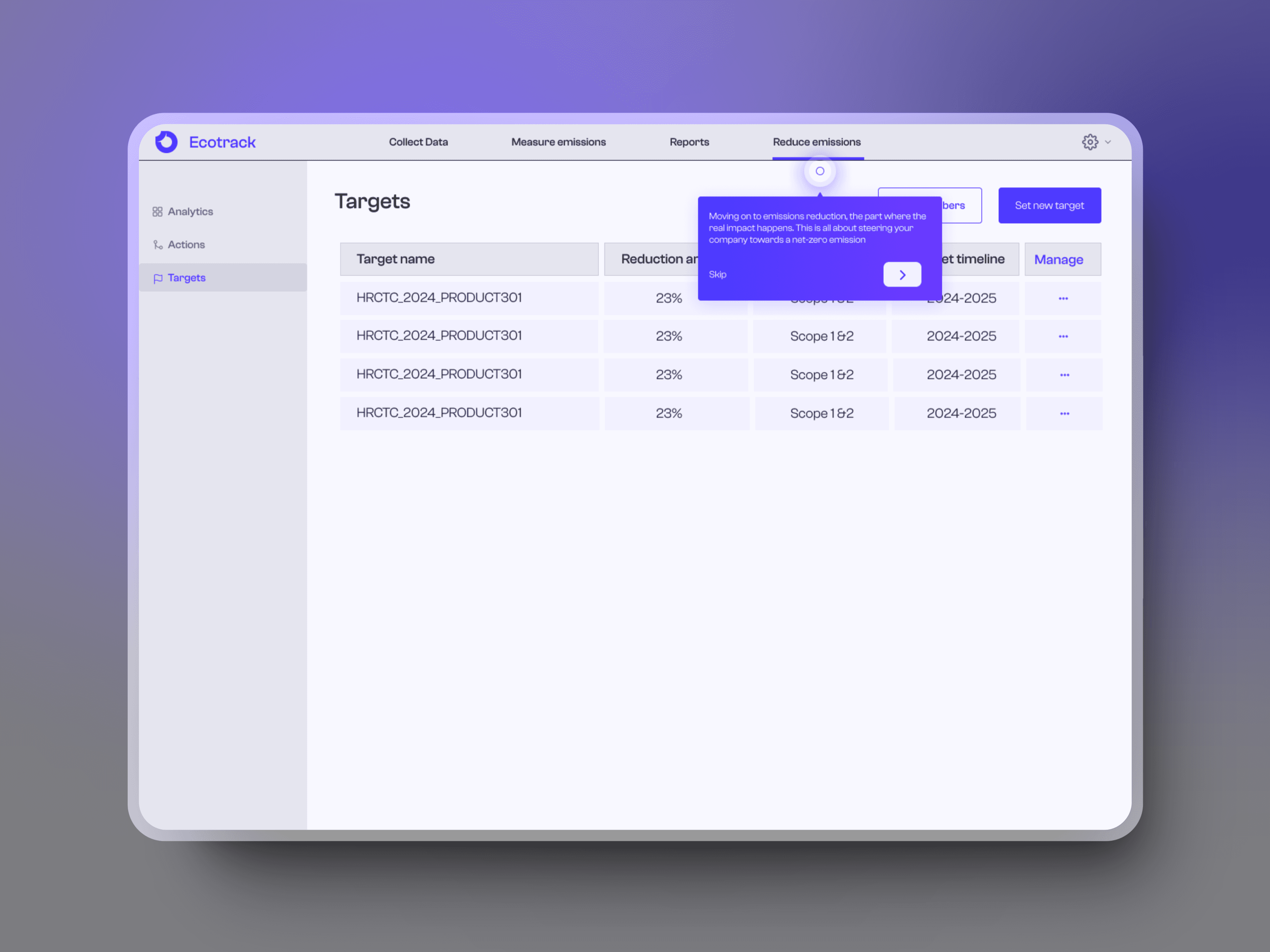
Here again the user is guided through a tooltip to help them set targets with relevant fields and fill them up with target timelines, scopes and reduction percentages.

The user can view how their targets are doing in a visual manner with how close they were to reach targets in quarters of a year with how much they will need to spend to compensate for the targets to be achieved successfully.
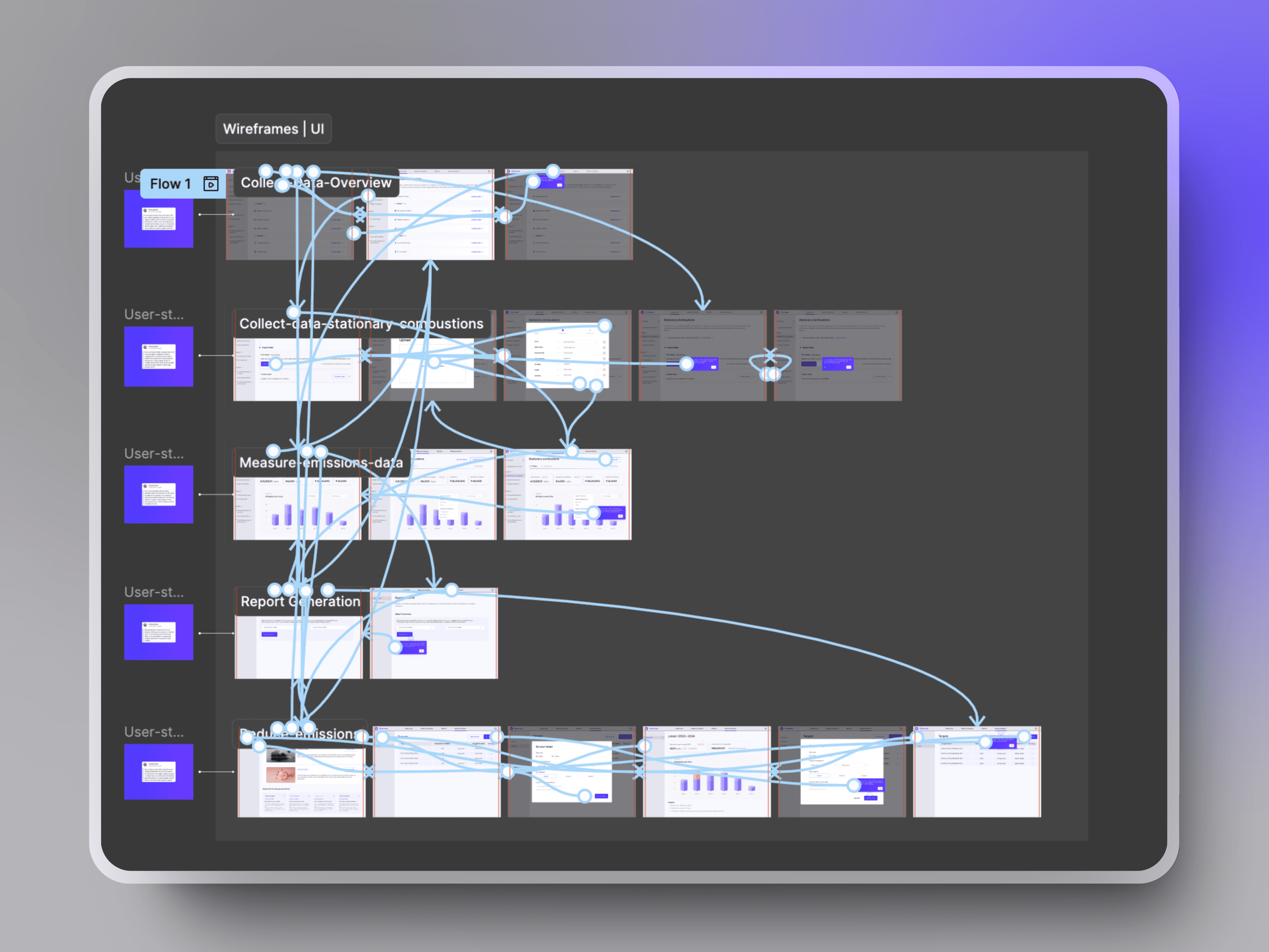
Glimpse of a designer's file while prototyping
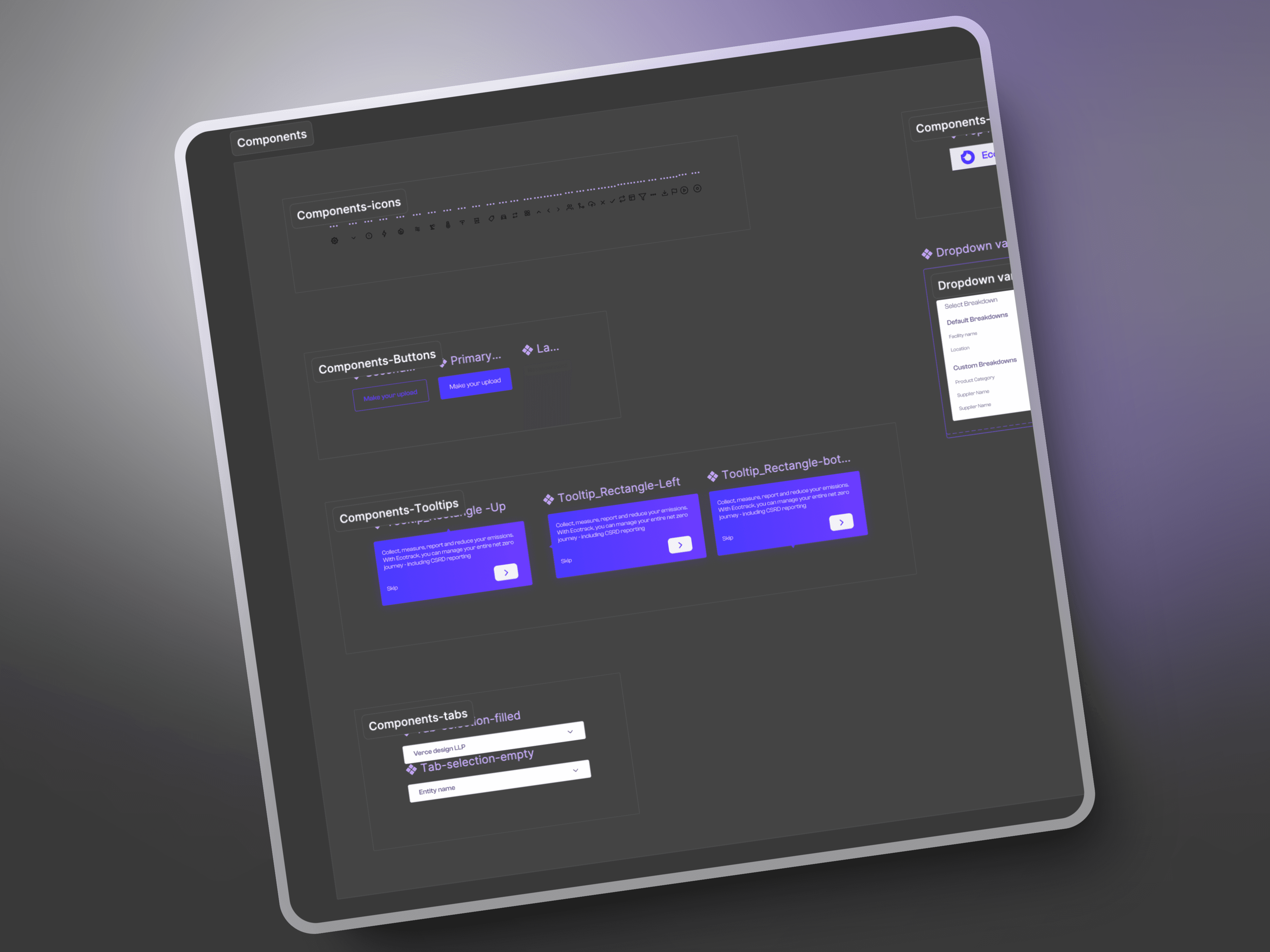
Creating components can be tedious but equally rewarding when they come in handy
In my Figma, every flow has a user story attached to it to simplify the understanding of my design file for a non-designer viewing it
